
To view the full sized image CLICK HERE.
A beautiful design by Ana Raquel Riedel von Teschenhausen.
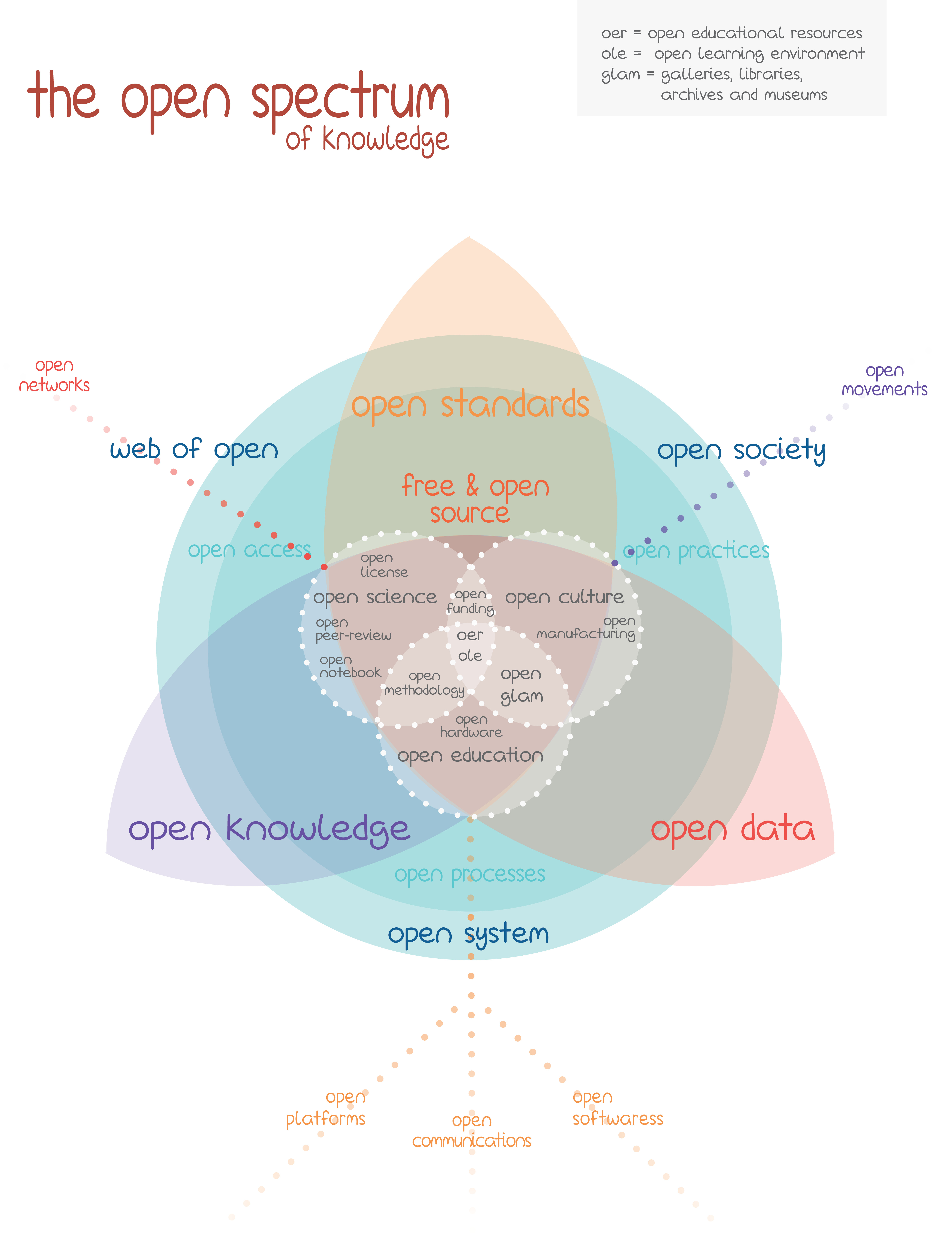
“After visiting the OKCon – Open Knowledge Conference in September 2013 I was overwhelmed by so many inputs on ‘openness’ and since I had to deliver a report on the conference for novice people on the subject, I’ve decided to try to make sense of all these open movements visually, my way, and annex it to the general report.
The result is this beautiful (as a very aesthetically conscious friend of mine has put it) visual map. I wouldn’t say that it is an infographic since it needs some guidance to be read as, which is what an infographic should avoid.
I’ve designed it using 50% of intuition and 50% of digging in the web on the topic and talking to the open community. I’m sure that there are many people in the community who would say that something important is missing, or something else is terribly misplaced, since this is a very fuzzy set of overlapping domains. Some would even mention that it’s not possible to put it like that. But I think it is. Many minds could make a more accurate visualization of this whole possible. And that would be really cool (and useful). Therefore it would be great if this map could be an open project in a webpage where everybody could edit it freely.
But I’ve used InDesign to create this, and I have no idea how can I make it “open”. But as the title announces, it was always meant to be an open spectrum, open for discussions and suggestions. So if you have some hints, please contact me and we can talk about changing it, or I may send the .indd file for modification. PS: I’m not a designer. Maybe amateur…
Advises for reading the map as I’ve thought it (open for any alternative interpretation):
first note that the choice of these opens instead of others has much to do with the focus of OKCon 2013;
there are 3 axes which may be read starting from the big leaf to the other corner;
the inner blue circle refers as I’ve mentioned to 3 modes of openness: open access, open processes and open practices, inspired by the notes of Michel Bauwens on http://blog.p2pfoundation.net/distinguishing-open-access-from-open-process/2006/01/29 , who names the first two of them; each of these 3 modes placed in the inner blue circle refer to its opposite sphere (leaf). Read: open access->open data, open practices->open knowledge, open processes ->open standards (free and open source); the main node refers to the 3 spectrums of Open Knowledge which are dependent on the other 2 leafs; the outer blue circle regards the whole embracing it all (probably what will turn out to be the most controversial placement among other readers), still referring to the 3 axes;”
The graphic was originally designed using Adobe InDesign we tried converting the file to an Open Format for use in the Open Source equivalent Scribus. However the process is not straightforward and would have required reproducing most of the graphic from scratch. So alternatively the linked Zip file contains 3 files. Two InDesign Files with itemised layers for easy editing and for those that are interested in remixing and making derivative works we have also included the background of the image without the text.
Ana would appreciate attribution for her work and would love to hear about any remixes or mods. Her contact details are included with the files.
This work uses the Peer Production License. http://p2pfoundation.net/Peer_Production_License